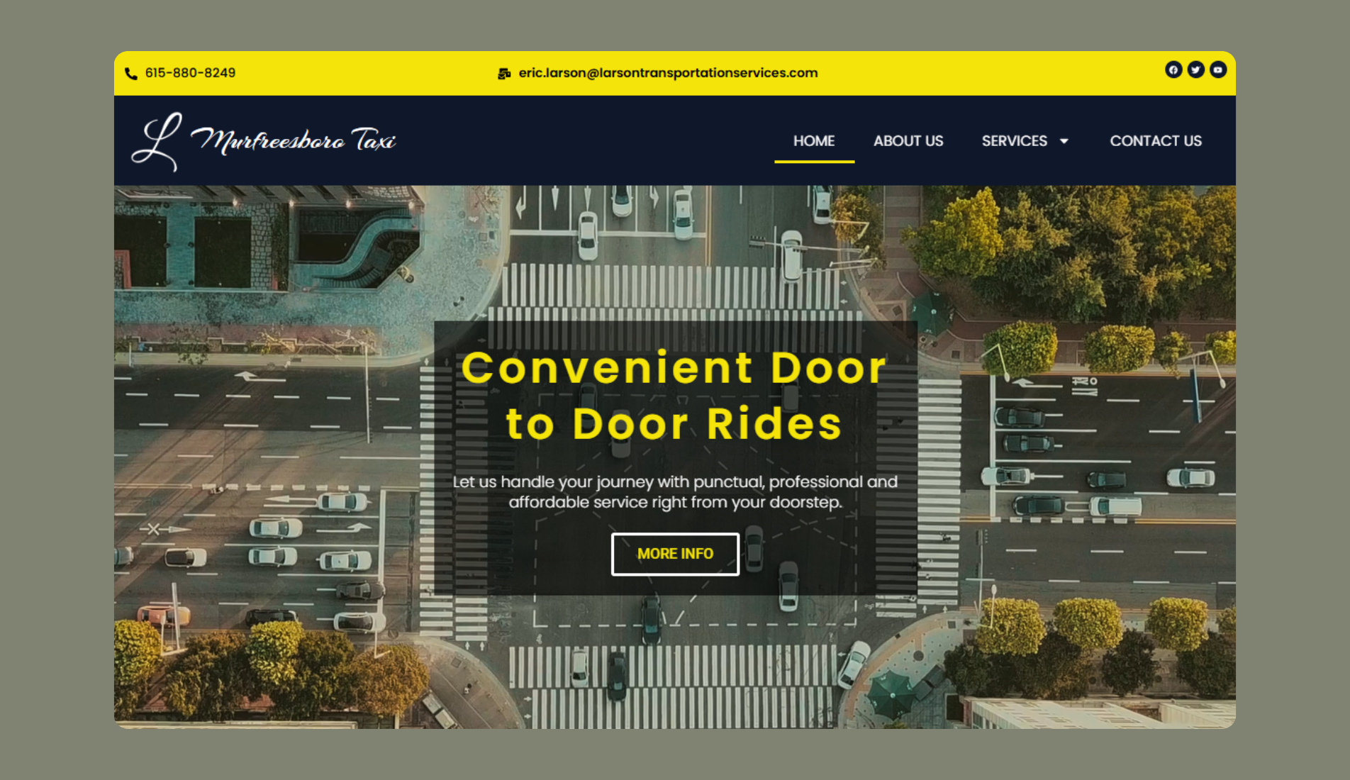
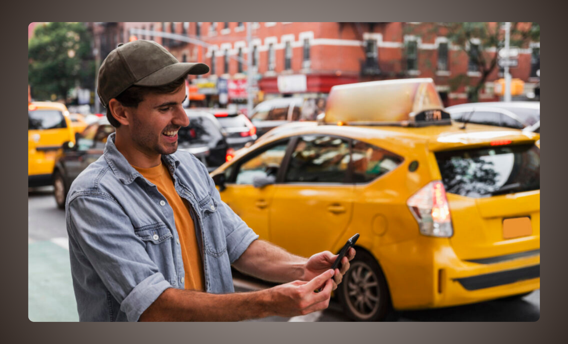
Bringing a warm and trustworthy digital identity to Murfreesboro Taxi, a locally owned and operated transportation company grounded in strong community values. The new website reflects their deep-rooted promise of safety, reliability, and genuine Southern hospitality. More than just a ride, Murfreesboro Taxi offers a service where passengers are treated like family.
To reflect their strong community roots and no-compromise service promise, we used a bold, clean visual identity. The color palette—featuring bright yellow (#f4e409), deep navy (#0f172a), and slate gray (#4a4a4a)—emphasizes both visibility and professionalism.
Typography is simple and human-friendly: Montserrat for strong headers, Poppins for accessible, clean body text. Every section reinforces the brand’s personal approach to service, from safety certifications to warm booking messages.
COMMUNITY-CENTERED BRANDING
UX DESIGN FOR FAST BOOKING
RESPONSIVE WEB DESIGN
SERVICE HIGHLIGHT ARCHITECTURE
Typhography
Poppins
abcdefghijklmnopqrstuvwxyz
0123456789
Aa
Montserrat
abcdefghijklmnopqrstuvwxyz
0123456789
Aa
Colors
#f4e409#0f172a#4a4a4a
02
The Solution
A website that feels as reliable as their rides
The new Murfreesboro Taxi website is focused on approachability and simplicity. Clean layouts, clear messaging, and easy booking access make it convenient for all users—from locals booking regular rides to new clients looking for a trusted service.
We embedded the company’s core values—drug-free, criminal-free, licensed, and bonded—into every part of the site. Icons, badges, and straightforward language build trust fast, especially with new customers.
It’s more than a taxi website. It’s a digital extension of a trusted local service where every passenger is treated like family.